Oh sorry to hear that mate. If you do anything related to photoshop related football badge creating i'm sure you'll be back in work in no time.
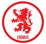
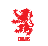
I don't hate that latest one, i prefer the other lion, and the two different reds are a bit much (Red 1 = The lion, Red 2 = The outer circle) - I think a single shade of red would work better.
I'm not sure i like the transporter bridge on there, especially with all the noise about it being unstable and serious potential for it being pulled down in our lifetime. I understand its the history of the town, but it's not really related to the club and for most of our history the club played miles away from it.
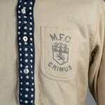
I think just the circle badge, with that nice new font and the old '86 lion with the detatched claws, in one shade of red is the best bet. VERY similiar to the old 86 badge just with a fresher font. Perhaps the word ERIMUS under the lion where in your latest design you had '86'
So much to think about... I wish i was good at photoshop but then again i'd get nothing done.

")