festa5
Well-known member
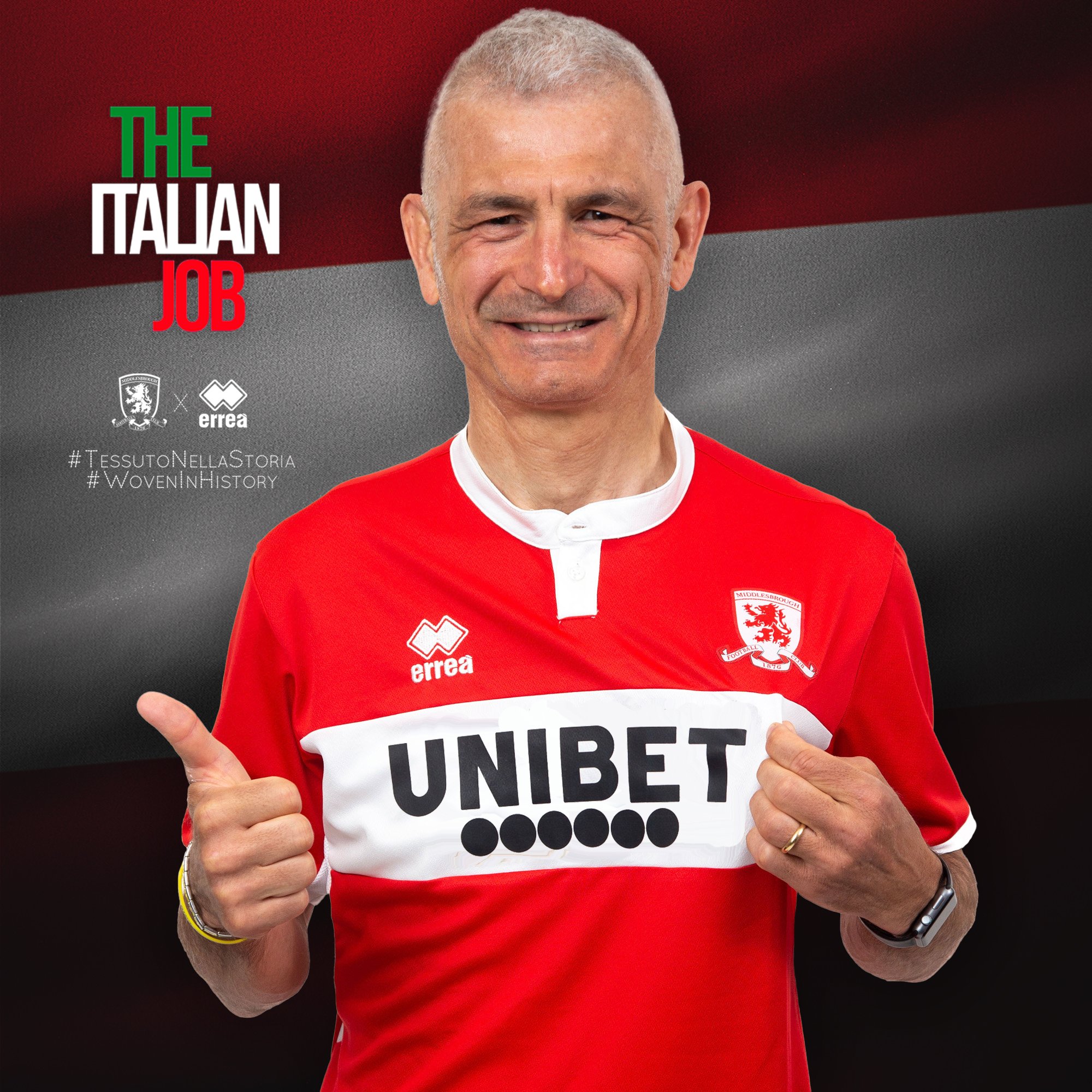
Basically the white band has been used as an advertising billboard. It's as if someone thought the space needed filling so we now have three rows of ***** in there. It looks bloody awful.
The "warning" looks like it shouldn't even be there, as if someone stuck it on as an afterthought.
A sponsor doesn't have to ruin a shirt (although arguably any betting company, however well done does exactly that) but plenty of ours in recent seasons have been.
Do the shirt manufacturers take into account what the shirt looks like with the sponsor when they're designing them? Because ours frequently look like they're pretty much just stuck on as an afterthought regardless of how it looks.


")