London_Boro
Well-known member
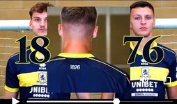
Why can't we have the badge behind them on the kit?!
Why can't we have the badge behind them on the kit?!
I think someone is trying to make a point that navy blue is a part of our colour identity. Hence its use on the home kit as well as here.Why are they in front of a huge pre 1986 badge, which has no significance whatsoever to a blue/yellow away kit.
Edit - damn you Kevo4
EDIT: SORRY. Misread your message. I didn't see the large badge in the background. I thought you were on about the embroidered lion badge on the back of the shirt, at the nape of the neck.
*****************
It is also on the same area on the white 3rd shirt (which will be used again this season. Indeed, the sleeves of that shirt is patterns based on the same badge.

Definitely agree. I wear all my old kits for 5 aside and this week I had the blue one we had in the PL season. That year the sponsor was noticeably smaller, just Ramsdens.tv in a small, tidy font. Shame it was wasted on that terrible home kit but the away kit was great. Wish there was a maximum size we would enforce. This season's 3 rows of logo/text is far too much. Still not as bad as the big green Ramsdens logo we had at one pointYeah that's pretty good. The thing that compromises all of our kits is the overly busy sponsors logo. Looks better underneath rather than in the band.
They do now though, AFC Wimbledon that isThey've never had a yellow band across their kit.
It's Boca Juniors all over.
Agree. Fairly good.First thoughts are it's a decent kit and I like it.
Sorry I can't go to either extreme viewpoint of best/worst kit ever which is so typical of many posters on fmttm.
They do now though, AFC Wimbledon that is
Theirs is always more of a bright blue though, apart from a brief dark blue spell in the 90s, this is definitely more BocaAh, so they do for the coming season.
Funny little coincidence that their first ever band is the same time as we release this beauty.
