Tories good with the economy myth

Laughing

Well-known member
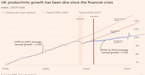
Tories are often seen as the government of fiscal responsibility. I came across this graph, which whilst not new, it is relevant today in the middle of a financial and economic crisis.
1660644905774.png

it really is easy to see that the economy grew at a fairly predictable rate under both previous labour governments and, to be fair, thatcher and major. After the financial crash there was a very real dip in economic growth but the thin red line is a forecast of where Labour were heading under brown, and that may have gotten even better, given a bit more time. Since 2012, under successive tory leaders the economy has grown at a contracted rate, with May, Johnson and will continue in this vain with Truss.

The contraction is about 15% per year. Given that salaries follow economic growth closely, it would be like getting the equivalent of a 15% pay rise every year over the last 10 years.

The graph clearly shows that a contracted economy, battering the poor, slaughtering the NHS, policing and public services has been a tory ideology and not the result of the financial crash, brexit, covid or the war in Ukraine.
 
Have you got a graph that shows how well the richest and the poorest have done because the gap between those things getting wider is what the Tories means when they say good with the economy.
 
Have you got a graph that shows how well the richest and the poorest have done because the gap between those things getting wider is what the Tories means when they say good with the economy.
That wasn't really the point of the graph. The main point was that after the financial crash, Labour recovered very quickly and the thin red line shows clearly that austerity wasn't required and killed the most financially vulnerable in our society.

The thin red line is very subtle (if it weren't drawn on the graph) and many wouldn't notice it.
Yeh, I completely understand. My point is very similar to @WoodallServices point in that it is PR they are good at. The economy is doing exactly what a Tory government would want it to. As long as the right people are seeing their assets increase in value relative to the rest of the population then they are doing their job. We know that in reality bleating about being sensible with money because you aren't giving handouts to people isn't the same as actually being sensible. The Tories pillory Labour because Labour say they would borrow money to fund certain things while simultaneously borrowing record amounts themselves and giving it to people and businesses that don't even need it.
 
Capitalism = profit over everything...
dividends over investment
Capitalism doesn't work but neither does socialism. For some things a free market works, for others a government owned, run or regulated works best.

I think it was openhiemer talking in the fifties put it best. Comparing governments with particle/wave duality. Physicists have to hold 2 opposing models in their head. The wave model and the particle model. Governments tend to be all one of the other. He used communism v capitalism because it was the 50's. In any event he was right.
 
Tories are often seen as the government of fiscal responsibility. I came across this graph, which whilst not new, it is relevant today in the middle of a financial and economic crisis.

View attachment 42863

it really is easy to see that the economy grew at a fairly predictable rate under both previous labour governments and, to be fair, thatcher and major. After the financial crash there was a very real dip in economic growth but the thin red line is a forecast of where Labour were heading under brown, and that may have gotten even better, given a bit more time. Since 2012, under successive tory leaders the economy has grown at a contracted rate, with May, Johnson and will continue in this vain with Truss.

The contraction is about 15% per year. Given that salaries follow economic growth closely, it would be like getting the equivalent of a 15% pay rise every year over the last 10 years.

The graph clearly shows that a contracted economy, battering the poor, slaughtering the NHS, policing and public services has been a tory ideology and not the result of the financial crash, brexit, covid or the war in Ukraine.
I hate the Tories as much as anyone but the graph doesn't prove a great deal and The Tories took over in 2010, not 2012, so that vertical red line needs to be two years over to the left. So that makes the red labour projection and the pre-crash projection both meaningless, the recession was always going to hurt over a number of years, no matter who was in power. The tories just decided to screw over the working class more during this time.

1990 to 1997 was under John Major, who wasn't so bad for a Tory, and growth for that time was similar to Labour in 1997-2008. That's a good 18 years of pretty good growth, for a developed nation, and after that sort of spell there's always going to be some sort of correction.

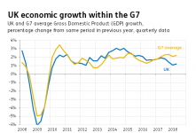
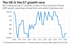
There was always going to be slow growth after the recession though, and the Tories had done ok (with the economy, but not much else) until around 2015. We were the fastest growing nation in the G7 prior to Brexit, but obviously, they (Little Englanders) shot the UK in the foot with Brexit, and since 2016 we've been the slowest growing in the G7.

So in summary,
1990-2008 - Pretty good growth
2008-2010 - inevitable recession/ crash
2010-2015 - not so bad recovery
2016+ - ****

It does show that the Tories are certainly no better with the economy mind, but in times of growth, they **** over the working class and public services to get it. They're also capable of pulling out an absolute catastrophe as they did with Brexit, but that's just as much down to those who voted for it.
 
Last edited:
I hate the Tories as much as anyone but the graph doesn't prove a great deal and The Tories took over in 2010, not 2012, so that vertical red line needs to be two years over to the left. So that makes the red labour projection and the pre-crash projection both meaningless, the recession was always going to hurt over a number of years, no matter who was in power. The tories just decided to screw over the working class more during this time.

1990 to 1997 was under John Major, who wasn't so bad for a Tory, and growth for that time was similar to Labour in 1997-2008. That's a good 18 years of pretty good growth, for a developed nation, and after that sort of spell there's always going to be some sort of correction.

There was always going to be slow growth after the recession though, and the Tories had done ok (with the economy, but not much else) until around 2015. We were the fastest growing nation in the G7 prior to Brexit, but obviously, they (Little Englanders) shot the UK in the foot with Brexit, and since 2016 we've been the slowest growing in the G7.

So in summary,
1990-2008 - Pretty good growth
2008-2010 - inevitable recession/ crash
2010-2015 - not so bad recovery
2016+ - ****

It does show that the Tories are certainly no better with the economy mind, but in times of growth, they **** over the working class and public services to get it. They're also capable of pulling out an absolute catastrophe as they did with Brexit, but that's just as much down to those who voted for it.
I can't agree with most of that. The tories took over in May 2010 so the thick red line needs to move over a bit, not 2 years, but the recovery has already started by Labour and quickly flattened under conservatives. Let's say the 12 months was a bedding in period.

So the graph doesn't prove anything? I am not even going to respond to the rest as that assertion is nonsense.
The red line is bang near the increment for year 2012, it's like 2011.8, and the Tories took over in like May 2010, so it's probably nearer 1.5 years. There's always post-recession bounce short term, whilst the markets find out where they're at.

Don't throw your teddies out, there's no need.

The graph proves Tories and Labour were similar from 1990-2008, then it's hard to infer anything after that as each recession recovery is different. You can go back hundreds of years to see this, and it's a fact we were the fastest growing economy in the G7 right up until the Brexit vote, since then it's been dog **** (compared to the G7).

For a graph like this to prove something, it needs to be compared to something meaningful, like compare growth V the G7, or nations similar to us like France/ Germany etc.

Your thread title is correct, for that graph at least, there is no proof on there that the Tories are better for the economy, but the time of worst comparable growth to those who matter is post-Brexit (i.e Brexit is worse than the Tories, but largely due to the Tory version we ended up with).

We were doing better pre the recession, but then had a worse recession, this often happens. From 2011 onwards we started climbing the G7 ladder, and were better than most (or all) of the G7 from 2013-2016, then we went off a cliff.

1660651768375.png
1660651787619.png
 
The red line is bang near the increment for year 2012, it's like 2011.8, and the Tories took over in like May 2010, so it's probably nearer 1.5 years. There's always post-recession bounce short term, whilst the markets find out where they're at.

Don't throw your teddies out, there's no need.

The graph proves Tories and Labour were similar from 1990-2008, then it's hard to infer anything after that as each recession recovery is different. You can go back hundreds of years to see this, and it's a fact we were the fastest growing economy in the G7 right up until the Brexit vote, since then it's been dog **** (compared to the G7).

For a graph like this to prove something, it needs to be compared to something meaningful, like compare growth V the G7, or nations similar to us like France/ Germany etc.

Your thread title is correct, for that graph at least, there is no proof on there that the Tories are better for the economy, but the time of worst comparable growth to those who matter is post-Brexit (i.e Brexit is worse than the Tories, but largely due to the Tory version we ended up with).

We were doing better pre the recession, but then had a worse recession, this often happens. From 2011 onwards we started climbing the G7 ladder, and were better than most (or all) of the G7 from 2013-2016, then we went off a cliff.

View attachment 42871
View attachment 42872
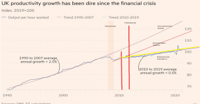
I think you are misreading the graph x axis. I have added a dash for may 2010. Its a year and a couple of months at most. That aside they were quickly scribbled lines. I have added a yellow best fit from may 2010. It tells exactly the same story.

Your assertion that the graph has to compare like to like - Really? The graph doesn't compare like for like? Its 12 years of tory rule compared to about 18 years previous.

To say that the end to contraction of the economy would always happen, even if Labour had not been in power, and it would have dipped after 2010 even if Labour had stayed in government? And you say my comparison is bad?

The lines on the graph tell a story you are arguing with. You will be arguing with someone else on this thread from this point on, because I can't be bothered arguing with you on this subject, you are wrong.

New updated graph, its the same!

1660653286026.png
 
Growth rate graphs are a waste of time. It is far better to show an index. I can't tell if @Laughing 's graph is an index or not. Indexes are much easier to assess the actual difference.
1660651768375.png
 
Ooooh - laughing you have come on here with a hypothesis, people are allowed to debate it. There’s no need to get so stroppy.

It’s too simplistic to compare Tories to Labour over such a long time period- given external factors and what was going on in the world during those times. It does make more sense to compare to other countries during the same time period.
 
Growth rate graphs are a waste of time. It is far better to show an index. I can't tell if @Laughing 's graph is an index or not. Indexes are much easier to assess the actual difference.
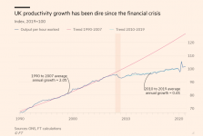
The original graph is from the financial times. It's an index, Nano
 
Ooooh - laughing you have come on here with a hypothesis, people are allowed to debate it. There’s no need to get so stroppy.

It’s too simplistic to compare Tories to Labour over such a long time period- given external factors and what was going on in the world during those times. It does make more sense to compare to other countries during the same time period.
:DMe stroppy! mayhap. In any event it was Andy's debate points that I had an issue with. They started off as nonsense. It may be simplistic to compare economic growth between tories and labour. It's certainly simpler than comparing with G7 economies that vary massively. The only G7 economies that are comparable to the UK are France, Italy. You could include Germany and Canada to a lesser extent, but their economies are quite different too. One is much smaller and the other significantly bigger. USA, Japan and Germany are much bigger economies, albeit all on different scales.

So yup it is simplistic. It's not wrong though and I could produce comparable graphs for NHS investment, salaries, rate of serious criminal convictions, waiting times for your GP, per pupil spend in eductaion... Pick a metric and the graphs will mirror the economic growth. this my friend is a fact.
 
I think you are misreading the graph x axis. I have added a dash for may 2010. Its a year and a couple of months at most. That aside they were quickly scribbled lines. I have added a yellow best fit from may 2010. It tells exactly the same story.

Your assertion that the graph has to compare like to like - Really? The graph doesn't compare like for like? Its 12 years of tory rule compared to about 18 years previous.

To say that the end to contraction of the economy would always happen, even if Labour had not been in power, and it would have dipped after 2010 even if Labour had stayed in government? And you say my comparison is bad?

The lines on the graph tell a story you are arguing with. You will be arguing with someone else on this thread from this point on, because I can't be bothered arguing with you on this subject, you are wrong.

New updated graph, its the same!

View attachment 42873
I hadn't, each dash is a year, but now the left vertical red line is now in the right place (y)

The yellow line is fine (it's similar to Blue one which FT already had on there from 2010-19), which isn't great of course.

Tories were in charge from 1979 to 1997, so 7/18 of those years before 2008 were under the Tories, Labour kept it the same, they both did fine for the economy/ production.

The problem is the additional lines to what was in the article. You can't apply a red trend line from 1 year (immediately after a recession), and infer that it's going to carry on that way for 11 years, it doesn't work like that.

Also, that pink line which FT wrote on there is not "pre crash economic forecast", it's a trend from 1990 to 2007, expecting that to continue for another 12 years is ludicrous, especially as we know there was a recession in 2008, and most of the time there is a recession every 10-20 years. The line should not have even been on there beyond 2009.

There are always recessions, and there are always recoveries, and each is very different. The best comparator is not previous years, it's comparing with other comparable nations or an average of them.

1660653970594.png
 
Last edited:
Back
Top